It’s manually impossible to understand the structure of a dataset with 100 dimensions. And it’s fairly common to come across data having so many features. And the exploratory-analysis of data is a preliminary step, before proceeding to other aspects of data-wrangling and models. This is where t-SNE comes in.
t-SNE is non-linear dimensionality reduction algorithm. It reduces each high-dimensional point and embeds them into a 2D/3D map. Additionally, it ensures that similar objects are nearby and dissimilar points are kept apart.
Uses of t-SNE
- It’s hard to visualize high-dimensional objects
- Existing data-visualization techniques only enable visualization of few variables at a time.
- Helps to find the local structures in data, and see if there are any clusters of points in the high-dimensional manifold.
- Helps us decide if there are any distinct classes in the data, whether they are linearly or nonlinearly separable, etc.
- It’s used in a lot of applications cutting across Computer Security, Music Analysis, Cancer research, and in abstract cases like visualising the learnings of different layers of a Artificial Neural Network, etc.
Here’s a nice example of t-SNE’s usage in last year’s IEEE project(GoT chabot) https://gist.github.com/kaushiksk/ea0c0f25c082acb8604ad84466f85ca8
It’s necessary to know about other dimensionality reduction techniques like Principal Component Analysis (PCA) to truly appreciate the distinctive nature of t-SNE.
PCA
PCA tries to retain the maximum information about high-dimensional data even after embedding it into a low dimension. It does this by finding out a few components in the higher dimension along which the maximum variation of the data is ensured. Hence it preserves the variation in the data even after reducing it to a lower dimension. Mathematically, PCA minimises the squared-error between points - essentially ensures that far-away points in the original dataset remain in the same way in the 2D map also. So PCA preserves large pairwise distances(global structure and properties), but these distances do not imply any meaningful property. But it loses the the low-variance deviations between neighbours. t-SNE filled this gap by accounting for local properties, which have a lot of significance irrespective of the overall structure/topology of data.
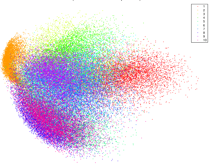
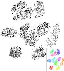
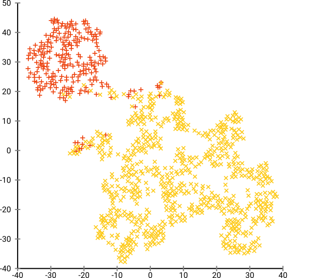
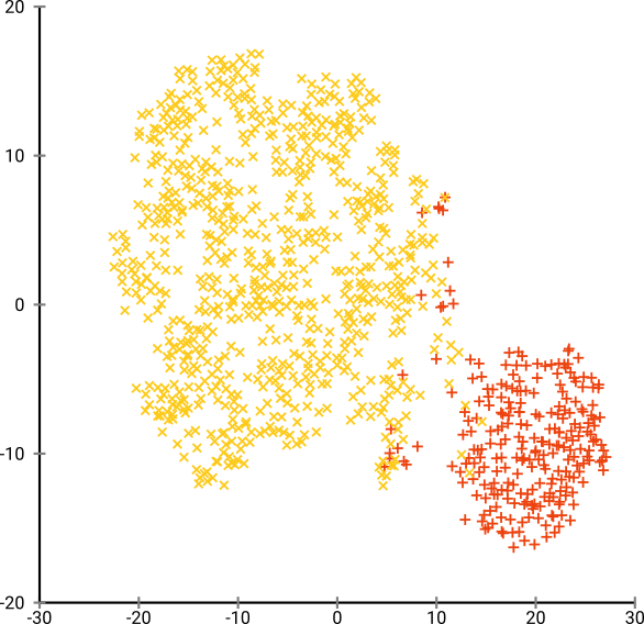
Moreover PCA is not very useful for unlabelled data. This is quite evident by looking at the visualizations produced by PCA and t-SNE on the MNIST dataset.
Distinct clusters are not produced by PCA. The distinctness is evident only because of the color-coding, so PCA is not very helpful for unlabelled data.
On the other hand, the presence of clusters is striking with unlabelled-data using t-SNE. The bottom right, we can see the labelled version of the same. Hence, t-SNE finds a lot of utility with unlabelled data, over and above PCA.
Some Interesting properties of t-SNE:
- Crowding problem: Semantically similar points in higher dimension will collapse onto one-another when brought down to a lower dimension. t-SNE solves this problem, unlike the previous dimensionality algorithms like PCA and SNE.
So the effectiveness/relevance of t-SNE is put into question if the required output is in a fairly higher dimension, where the possibility of crowding is low. On the other hand, PCA always gives the best components along which the variance of the data is maximised.
Hence, the results of t-SNE is much better if the degrees of freedom is increased, because the crowding problem is less severe. Consequently, visualising data in 3D rather than 2D gives a lot of gains in using t-SNE.
- t-SNE does not intentionally retain distances/densities: It only retains the probabilities. It adapts it’s idea of distance to the local-variations of densities. So it automatically expands dense clusters (to prevent overcrowding) and expands sparse ones. This effect is expected due to the design of the algorithm. Relative sizes/distances between clusters in a t-SNE do not have any sensible interpretation. The same reason can be attributed to why we can’t perform “clustering upon the output of t-SNE” using distance/density based algorithms like KNN/K-means. But neighbourhood-graph based clustering approaches will produce the desired result. Hence t-SNE is best used for visualization purposes only.
Do not apply clustering upon the output of t-SNE
- t-SNE uses a non-convex objective function: The error/divergence is minimised using gradient descent(which is initialised randomly), so we might get different results for different iterations/initialisations. t-SNE might have multiple minima which necessitates multiple runs, and places a question on the reproducibility of results. Practically, t-SNE is iterated until the results stabilise.
Multiple runs with the same parameters might not give the same result
-
Perplexity is one of the parameters required by the algorithm. It dictates the number of effective of neighbours to be considered while calculating probabilities. So, the perplexity of a distribution over N items can never be higher than N (in this case, the distribution will be uniform). At low values of perplexity, the local variations might dominate, so usually values between 5 and 50 are chosen. We don’t have a universal value of ideal perplexity that gives the best results for all types of datasets, so we will have to tune it as a hyper parameter. With increase in number and density of data points, perplexity should also increase.
-
t-SNE can generate fake patterns at suboptimal perplexities. We may be on a wild-goose chase if we incorrectly expect clusters when there are actually none.
Consider a gaussian distribution with 250 points in (-2, 0) and 500 points in (0, 2).
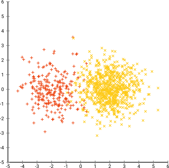
Using EM(Expectation Maximisation) clustering algorithm produces this result:
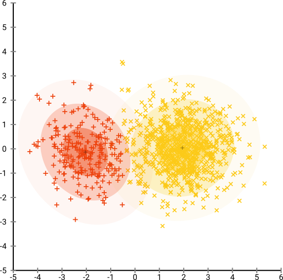
The following are the visualizations produced by t-SNE:
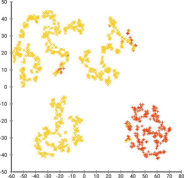
It’s easy to conclude that there are 4 clusters here, while there are only two.
Here, there are too many clusters, and it’s hard for any dim-reduction algorithm to find them. (Note: The color coding is only for our interpretation)
This result is from the optimum perplexity of 80, but since perplexity is a global parameter that needs to be tuned and is not the same for every dataset.
The results are even more stark when these visualizations are obtained from a gaussian distribution as illustrated here. (https://distill.pub/2016/misread-tsne/)
- Time complexity of t-SNE is O(N^2), N = Number of Data points. (grows quadratically) Since t-SNE, doesn’t scale well, PCA is first applied to the data (PCA has a better complexity) and number of features is reduced to a maximum of 50 dimensions. t-SNE is then applied onto the output of PCA. This step also ensures that t-SNE works with lesser noisy data.
But later implementations of t-SNE have better time complexity
There are certain cases t-SNE could be sub-optimal:
-
Interpretability: t-SNE only maps the local l variables correctly, and the global trends in the data isn’t accurately represented. But PCA’s results can be explained very easily.
-
Application to new data: t-SNE learns a non-parametric mapping - it does not learn an explicit function from the input space to the map. The embedding in t-SNE is learnt by directly moving the data from high-dimension to low dimension. So we can’t apply t-SNE on the fly for an incoming test data point. But we can always apply t-SNE on the whole dataset again. Alternately, we can train a multivariable regressor to predict the position of an input point in the map or directly minimise the t-SNE loss (https://lvdmaaten.github.io/publications/papers/AISTATS_2009.pdf).
-
Incomplete Data: t-SNE cannot handle incomplete data. A popular workaround is to use probabilistic PCA on the data, and then use t-SNE.
Further Reading:
- t-SNE
- Visualizing Representations: Deep Learning and Human Beings Christopher Olah’s blog, 2015
- https://distill.pub/2016/misread-tsne/
- Visualizing Data Using t-SNE
Despite these misgivings, t-SNE might probably be the first tool a data scientist uses in the morning! Have fun exploring it. Do comment below for any clarifications or suggestions.