Blast to the past
Websites weren’t always as smooth and easy to use. Infact, up until a few years ago, you could not even create the majority of the most common layouts seen on today’s internet. A look at the past can teach us a lot, from the internet culture back then to the type of websites used to share and propagate this culture.
Theme: Fun
Websites in the 2000s and even a little into the 2010s were all about the developers having fun and really just expressing themselves through their websites. Sure, most of the time the clients for the website probably had a say in the matter, but in the beginning, the clients were the same people that were making the websites.

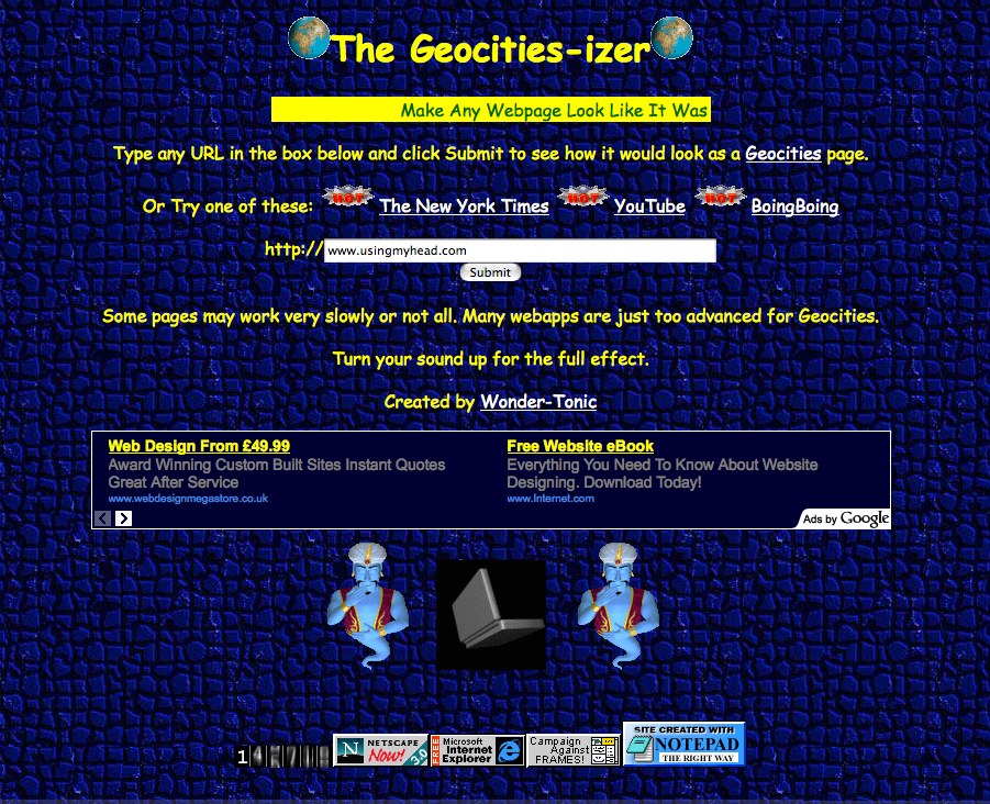
Unprofessional looking website with bad color contrast and random animations and gifs
An interesting and funny point to note about the time was the ubiquitous use of “the pop-up man”. It’s funny due to how prevalent this feature was despite how annoying and unprofessional it made the website look. This was a key feature throughout the era, where developers would do things on their website, simply because they could. All that is to say that websites of the past used to be a motley assortment of all the available patterns and structures available to them, to try and make something that would attract attention and draw clicks and traffic to the page.

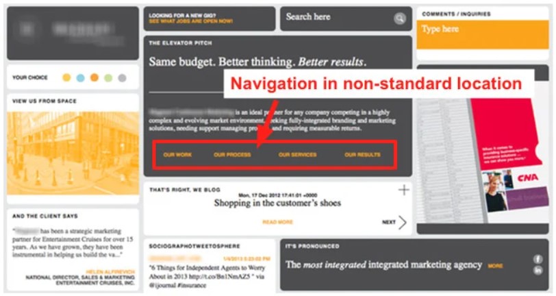
Weird or awkward positioning of navigation which left users lost in the website
Unfortunately, this also meant that it was very common for users to find themselves stranded on a webpage with nowhere else to go and needing to use the back arrow button on their browser to trace back their steps. As you can probably guess, this heavy emphasis on stylish, fancy, and attention-grabbing designs often left a lot of room for improvement with respect to functionality and uniformity within a website.
Technology as the hindering factor

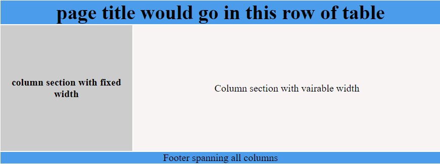
Technological constraints faced by past developers to create a simple layout
It’s hard to be super critical when revisiting such old pages as you have to take into consideration the era they are from and the technology that was available to them. Much of the popular layout formats or even the idea of easy-to-use interactivity tools were not even conceived back then. This meant that developers often found themselves pushing the boundaries of their imaginations to even be able to mimic simple structures.

easiness of rendering identical layouts using modern technology like flexbox
The example shown here illustrates how a web developer from way back would have tried to implement such a complex layout using tables (which as we all know are meant to show a tabular form of data) while nowadays we can easily build such layouts with a mix of flexbox and CSS grids. This is one of many such instances where it’s easy to correlate the bad design choices and website look and feels of the time to simply a lack of technology that could keep up with the developers.
Modern (?) websites
Luckily nowadays, you don’t have to go on the internet to see a mess of tables and poorly designed websites with even poorer graphics. However, Due to the widespread nature of the internet and how easy it is for someone to make a website for anything nowadays, it is still possible to find poorly designed web pages. Keep in mind, these webpages do NOT look bad, they are simply designed poorly, which is a distinction we will explore later.
Boundless options & the absence of structure
Developers nowadays suffer from a very peculiar problem: They have way too many options to choose from. Now although that may sound counterintuitive, it makes sense when you take a step back and think about what a website is really used for… and once you realize the multitude of uses for a website, that is when you are truly stumped. It is an unfortunate assumption that most engineers or web developers consider themselves less creative than their counterparts, as a result of which, parsing through such a wide array of options with no end in sight of a perfect website can be overwhelming for most.
Another thing that holds back modern websites is the belief that one has to be creative to be good at web design. This results in web developers often putting structured approaches to any problem (as they would in other fields) on the backburner when working on a website’s design. The lack of such a clear cut structure, compounds the vast array of options, resulting in some very dismal looking websites at their worst, and even at their best, just websites that are confusing to go through and use.
UX & UI
Design is not just what it looks like and feels like, design is how it works - Steve Jobs
Two terms familiar to most people even remotely interested in web development are - User Interface (UI) and User Experience (UX). However, there seems to be a huge gap between people that have heard these terms vs people that understand and implement them. To keep it short, the first part of Steve Jobs’ quote describes what most people would define as UI, while the quote as a whole, gives you a picture of what UX really is. Both literally and in practice, UX is what you get when you combine the UI with functionality (or rather, apply the correct UI to the appropriate functionality).

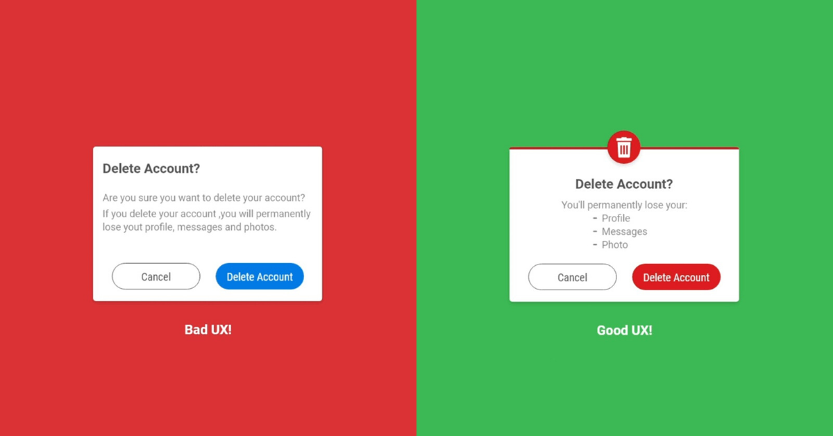
Coloring of the call to action button gives two different messages to the user regarding the importance and finality of the action
UX specifics
To provide something different from the usually conceptual and vague explanations of UX and UI, here are some specific pointers to keep in mind when designing:
- What is the website for
- Depending on whether the website is made for selling a product, a service, entertainment, or even within products, the type of product itself can determine the styling, design and overall feel of a website.
- Sticking to tried and tested page layouts and components
- It just so happens that humans tend to resonate more to familiar patterns and are usually wary about or stunned by changes in their environments. Applying similar logic to web design, if a client of a website requires trust and easy belief from the consumers. No matter how good it looks, it is best suited to go for a familiar layout as opposed to something that would make them second guess their purpose on the page
- Know where the focus should be
- In most sites where the end goal is for a consumer to subscribe or sign in through some form, it is best to make that section stand out the most and place it in the user’s path of action
- Simple is more
- Cluttering your page with a lot of information more often than not leads to lesser information actually getting through to the end-user. Instead pre parsing your information and sticking to only displaying what’s required and effective for the client should be the priority.
- Images, Icons & quotes
- All three being double edged swords, when used in the right places and types of websites, can completely blow new life into the page. However done wrong, (like placing icons on a website with a minimalist theme) can completely destroy the flow of the website.
Developers ≈ Designers
As mentioned earlier, the number one thing inhibiting developers from adopting good design practices is the belief that one has to be conventionally creative to perform well in such a field. However, the very fact that engineers can be web developers proves that one can simplify even this “creative” task down to a science and recognize patterns to implement logic to make objectively good designs. In today’s day and age where many new specializations are popping up, there is a good chance that in a few years, that profession of code-heavy web developers as we now know it will no longer exist. This isn’t such a big surprise as the work of a web developer looks way more different than it did 5 years ago. This should serve as a push to obtain design skills as a developer since even if code heavy developer jobs may cease to be, the design inputs of humans can still very much be useful and valued.
Stepping back from the speculation for a bit, it is no secret that having more skills under one’s belt is a boon, and web development being one of the easiest skills to pick up, having good design skills is what sets up the elite from the rest
